If you feel that you’ve already seen enough charts detailing the evisceration of the employment tribunal system by fees in recent days, then this post is not for you. Go and watch some football or something.
For those still with me – Hi Mum! – I’ve been looking at the regional breakdown of single and multiple claims included in yesterday’s statistical release by the Ministry of Injustice. And they make for some striking charts that put in context all those anecdotes from employment lawyers of tumbleweed blowing through the corridors and hearing rooms of regional ET centres.
This is the North East, where the average monthly number of claims (singles and multiples) has fallen by 85.5 per cent, from 1,561 in the 18 months prior to the introduction of fees in July 2013, to just 227 in the six-month period October 2013 – March 2014:

And this is the South West, where the average monthly number of single claims has fallen by 63 per cent, from 445 in the 18 months prior to the introduction of fees, to just 166 in the six-month period October 2013 – March 2014:

This is Scotland, where the average monthly number of claims (singles and multiples) has fallen by 67.4 per cent, from 945 in the 18 months prior to the introduction of fees in July 2013, to just 308 in the six-month period October 2013 – March 2014:
And this is Wales, where the average monthly number of claims (singles and multiples) has fallen by 71 per cent, from 404 in the 18 months prior to the introduction of fees, to just 117 in the six-month period October 2013 – March 2014:

And even London – with all those high-value discrimination claims from the City – is pretty much a wasteland, with the average monthly number of claims (singles and multiples) having plummeted by a staggering 88.5 per cent, from 7,952 to just 912:

But no need to worry as, according to the Ministry of Justice, this is all just a long-term trend, nothing to do with the fees regime introduced last July.
A long-term trend? Really? Let’s do a couple more charts. As suggested to me by Daniel Barnett, these show the rolling three-month average number of claims over the period March 2012 to March 2014. That is, each month’s figure is the average of that month and the previous two months. Such a rolling average smooths out the inevitable ups and downs from month to month, to give a more reliable indication of any longer-term trend.
And this is what we get on single claims:
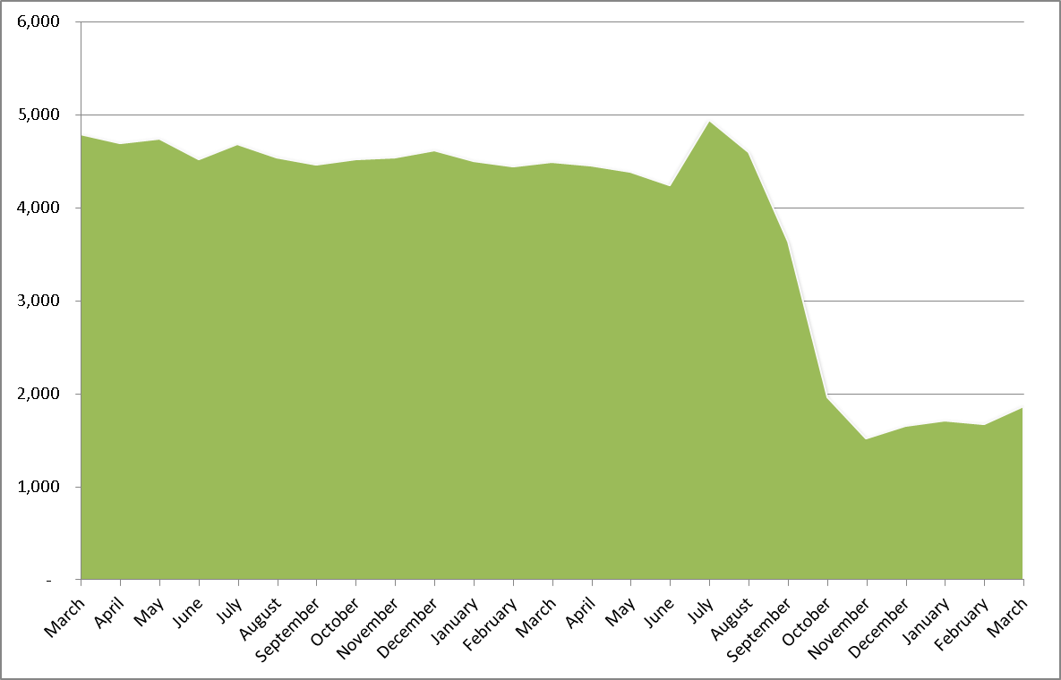
Does that look like a long-term trend to you? It looks more like a cliff-edge to me. And applying the same approach to multiple claims, we get this little shocker:

Again, if that’s a long-term trend, then I’m a banana.
But if anyone in the Ministry of Injustice is reading this – unlikely, I know – and would like to send me or Sean Jones some alternative charts showing their long-term downward trend, we would be very happy to reproduce them here on Hard Labour. I have of course seen Figure 3 on page 8 of the Ministry’s commentary on the quarterly statistics, which purports to show a long-term downward trend in both single claims and multiple claims encompassing the drop in claims since July 2013, but actually shows no such thing.
First of all, by cramming five years of data into one very small chart, the Ministry makes it difficult to distinguish very long-term (but shallow) trends from shorter-term, steeper movements such as that since July last year. Viewed from the moon, the Great Wall of China looks like a smoothly curved line, but viewed from a helicopter it clearly wiggles all over the place.
In any case, in terms of multiple claims, the Ministry’s pathetic little chart simply shows a mountain range of fluctuations, with no discernible trend whatsoever since as long ago as early 2011 until … the autumn of 2013. Sure, there were a couple of higher peaks in 2009 and 2010, not replicated since, but then there was a little difficulty in the economy at that time.
As for single claims, yes there was a steady but shallow decline from the peak in mid-2009, right the way through 2011 and 2012. Indeed, some of us tried hard (but failed) to get ministers to acknowledge that steady decline in 2012, when they were pushing through employment law and tribunal reforms predicated on allegedly explosive growth in the number of claims. But that shallow, long-term trend since 2009 does not begin to explain the cliff-edges shown in my (green) chart above.
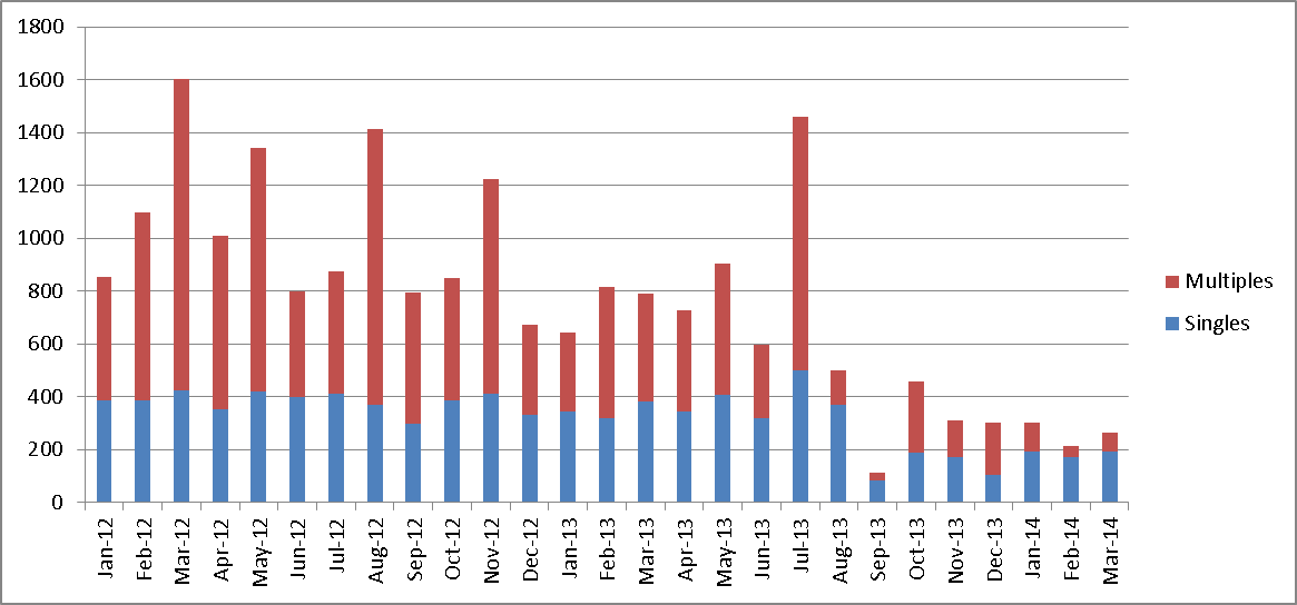
Ironically, the Ministry’s chart leaves out the only type of case in which there was a significant downward trend in the 12 months prior to the introduction of fees: multiple claimant cases. But, as the following chart shows, even that downward trend cannot conceal a marked acceleration of the fall in July 2013.

